There’s something genuinely frustrating about watching a brilliant wine get ignored on the shelf because its label doesn’t do it justice. You can have the best shiraz in the valley, but if your label looks like it was slapped together in 2003 or printed on flimsy material that curls at the edges, customers won’t even pick up the bottle. They’ll assume what’s inside matches what’s outside. Harsh? Maybe. True? Absolutely.
The Print Quality Problem Most Wineries Don’t See Coming: Here’s where many producers get it wrong. They focus on design but forget that printing label stickers properly matters just as much. A beautiful design printed on cheap stock with colours that don’t pop under retail lighting is like putting a budget suit on a racehorse. The material, the finish, the way ink sits on the surface, these details communicate value before anyone reads a single word on your label.
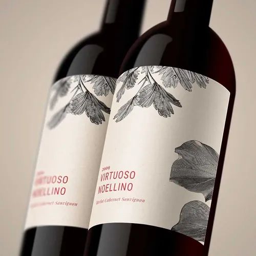
What Your Label Says Before Anyone Takes a Sip: Wine labels do more than list alcohol content and vineyard location. They’re making promises about what’s in the bottle. A standard paper label with smudged edges or fading colours suggests you cut corners. Perhaps that’s unfair, but it’s how retail psychology works when someone’s staring at fifty different bottles trying to decide what to buy.
When Your Label Becomes Your Only Sales Pitch
Compliance Doesn’t Have To Kill Your Vibe: Australian wine labelling laws exist for good reasons. You need origin statements, alcohol percentages, health warnings, and allergen information. But here’s the thing, compliance doesn’t have to murder your creativity. Smart producers use label printing as a way to weave legal requirements into their brand story rather than treating them as tiny-type afterthoughts crammed at the bottom like embarrassing footnotes.
Regional Expectations You Can’t Just Ignore: A Margaret River winery and a Hunter Valley producer need different label approaches. Your customers have preconceptions about what wines from different regions should look and feel like. Fighting those expectations might seem bold, but it often just confuses buyers who are trying to make quick decisions in the bottle shop. Your label needs to speak the visual language your target market expects, maybe with your own little twist to stand out.
The Premium Positioning Game (And How Labels Play It)
Material Choices That Actually Do The Talking: Think about textured papers versus smooth finishes. Matte versus gloss. These aren’t just aesthetic preferences, they’re signalling devices doing serious work. A rough-textured label with earthy tones says “artisanal, small batch, authentic” and a crisp white label with metallic accents screams “modern, premium, gift-worthy.” Getting this match right between what’s in the bottle and what’s on the outside takes a real understanding of where you sit in the market.
Storytelling Through Stuff You Can Actually Touch: Your label can reference your heritage without spelling it out in a boring paragraph. Maybe it’s through:
- Colour palettes that echo your vineyard’s soil
- Typography that nods to your region’s history
These physical touches do storytelling work that words alone can’t pull off. They make people want to pick up your bottle just to feel it, and that’s half the battle won right there.
Your label isn’t decoration or an afterthought. It’s your brand doing its job when you’re not in the room to explain why your wine deserves attention and a spot in someone’s shopping basket. Getting the branding right first, then backing it with quality printing that brings your vision to life properly, that’s what separates wines that fly off shelves from wines that collect dust. Perhaps some producers think labels don’t matter that much, but the market disagrees every single time someone walks past your bottle without stopping.
Ready to make your next vintage stand out for all the right reasons? Contact our team about labels that actually do your wine justice.
Featured Image Source: https://degqkf7c4iqz7.cloudfront.net/labexonpr/images/opt/products_gallery_images/Premium-Wine-Labels-Merlot-Zoom.jpg.webp?v=7055

